Planet Lab is a startup company that connects the worlds of cutting-edge science and technology innovation with youth and classrooms. Their goal is to make learning science fun, mobile and social.
We had the opportunity to sit down with three of Planet Lab's founders to see if we could help solve some concerns they had with their website. On this project, I was placed on a team with two other UI designers. Each team member presented their own work and took their own approach when completing the design challenges, however, we did participate in design critiques and advised each other when needed to better our work.
A) Redesign the landing page
B) Redesign the course page
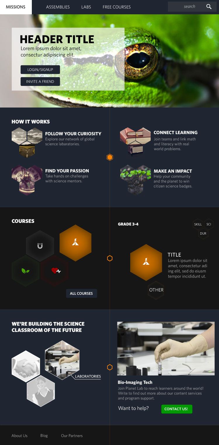
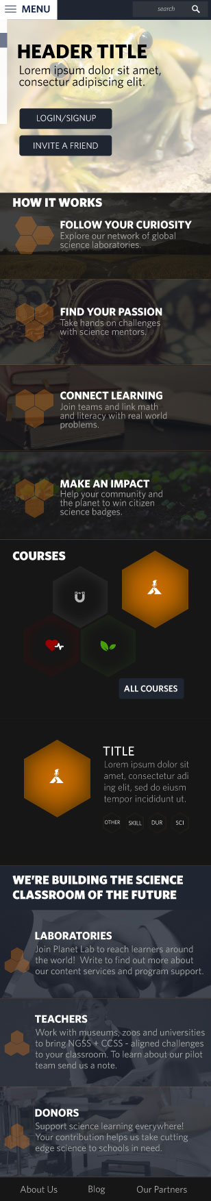
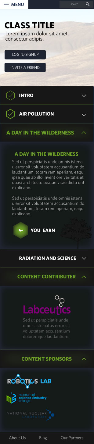
C) Create a tablet and mobile version
for the landing and course pages
In our first meeting with Planet Lab, it was clear they had big plans for their company but felt that their websites current aesthetic was unsuitable for the age range they were trying to reach (grades 3-8). To help us tackle this problem we began conducting a visual competitive analysis of some recommended sites they provided us along with a few other sites we hand picked that geared towards the aesthetic they were going for.
Below are a few examples of my competitive analysis:
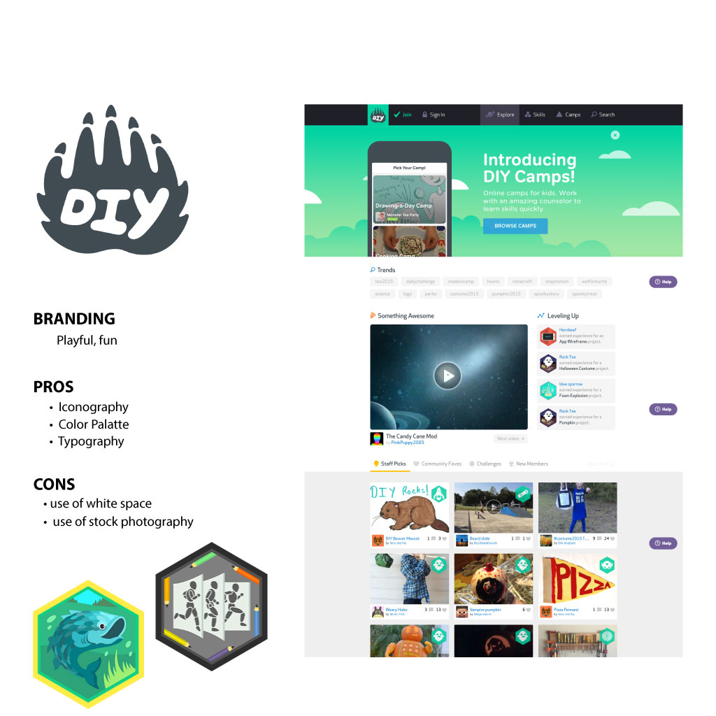
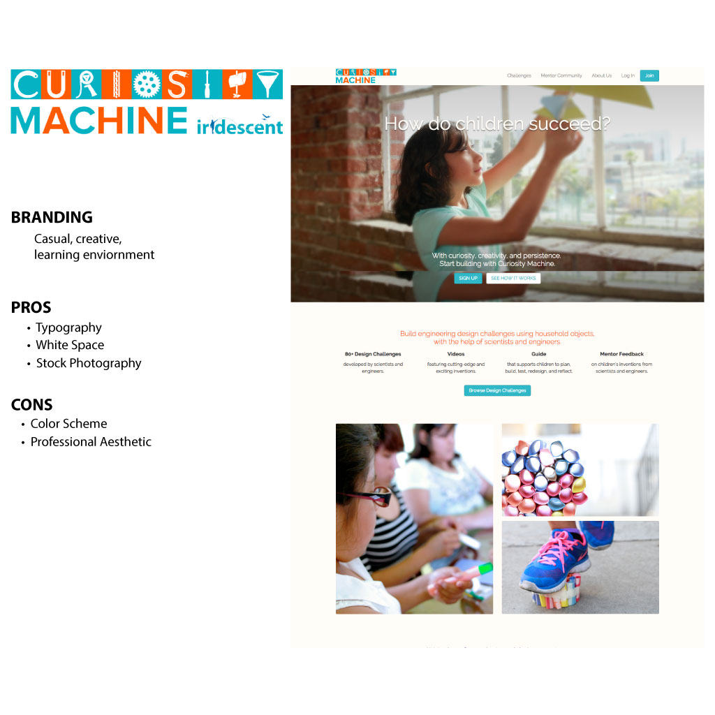
We analyzed over 10 sites and after a thorough review these were our key takeaways:
A) Fun and playful iconography used
B) Colorful and playful color palettes
C) Sans Serif typography
D) Use of white space
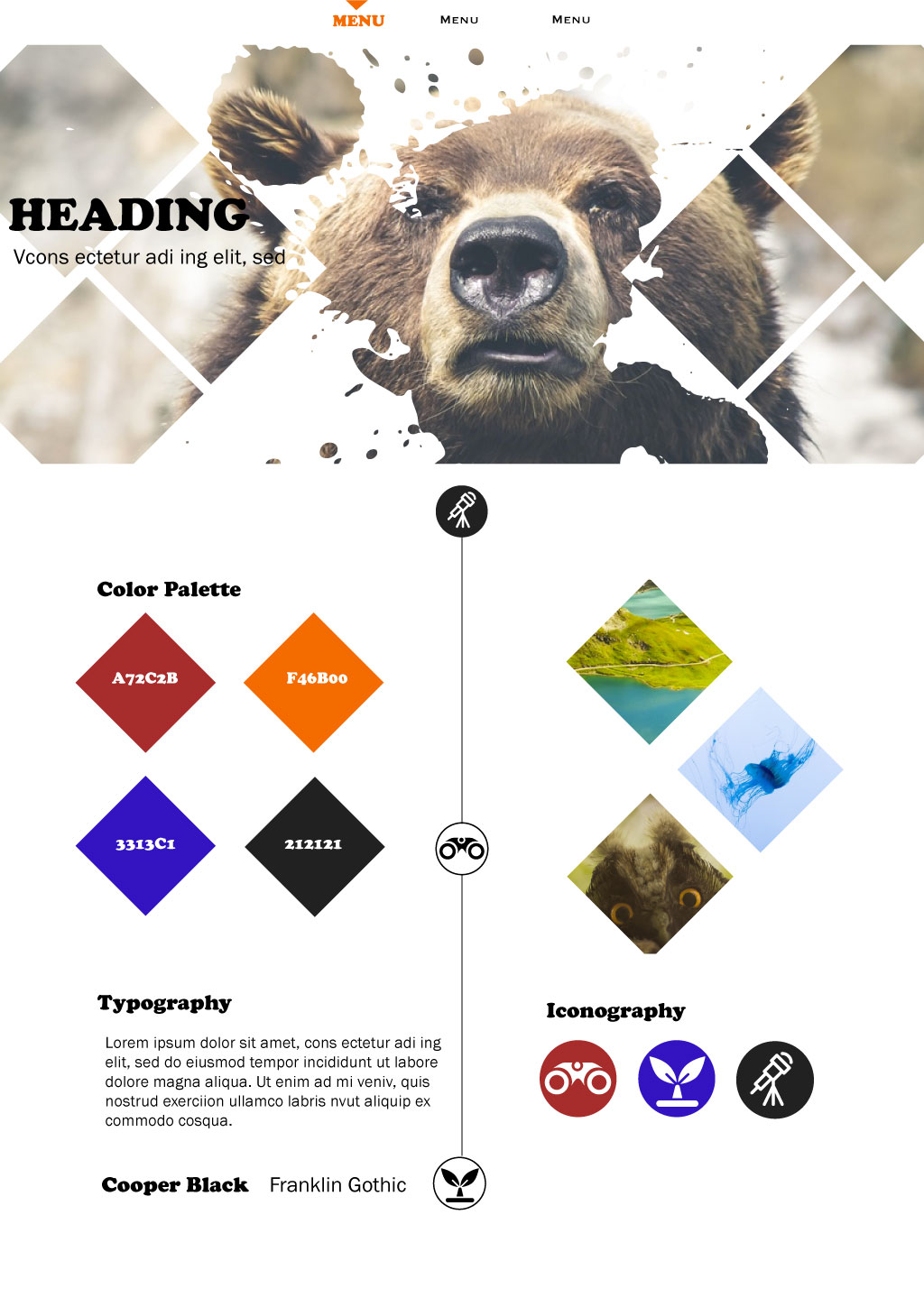
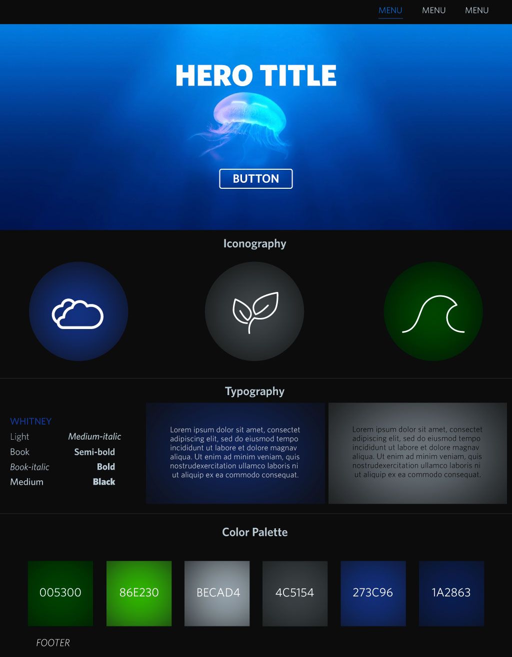
Along with our visual competitive analysis, we created style tiles with three different aesthetic feels to present to our client based on what we learned throughout our initial meeting. Our goal was to narrow down the exact aesthetic direction our client wanted to take based off of our visual competitive analysis and style tiles.
Below are three directions I explored:

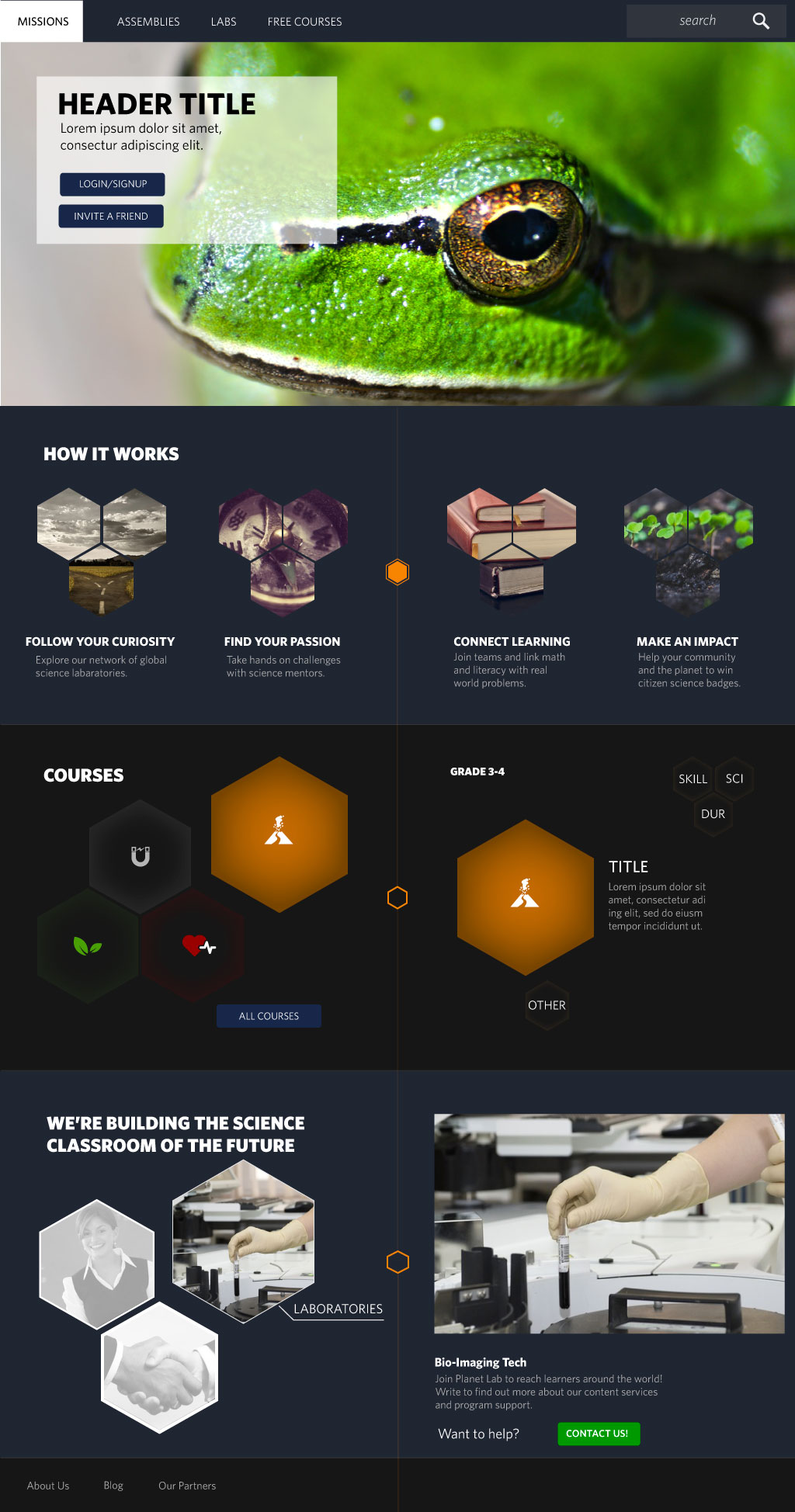
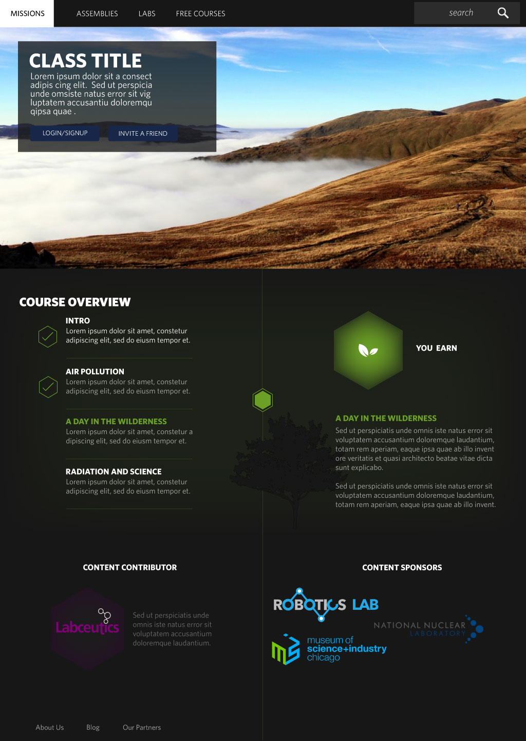
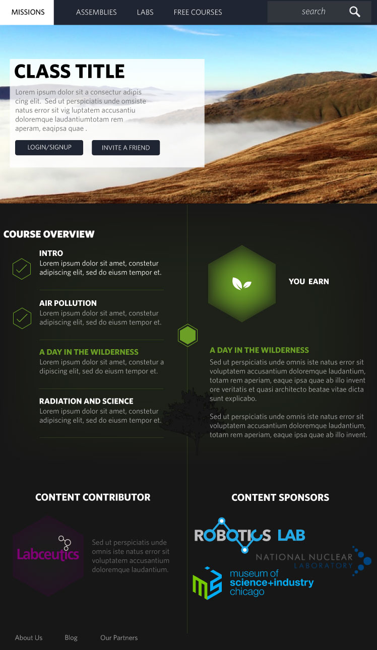
In our next meeting with planet lab, we presented our clients with style tiles, visual competitive analysis and received feedback on what design direction they wanted us to take. Our next step was for me to make high fidelity mockups of the landing page and courses page based off of wireframes gave to us by our client.
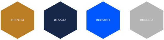
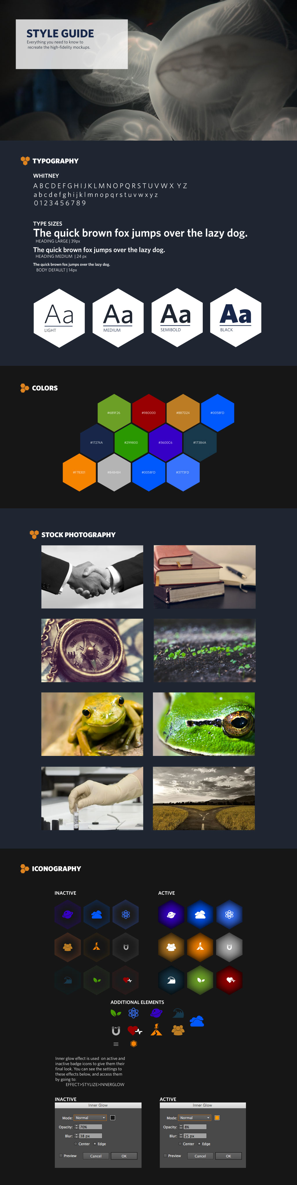
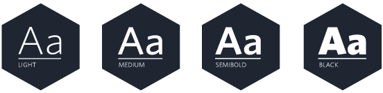
For my font choice, I chose the Whitney font collection for its various weight sizes and its youthful aesthetic.
The iconography I used was round and playful and chosen based on the grade level and age range I was appealing to.
Our clients really liked two different designs that I presented to them in my style tiles. The first was the dark background aesthetic of my third style and the second was the hexagon pattern that I presented in my first style tile.