Sidewalk.com is a startup company that is
looking to change the way retail brands meet objectives and drive sales by
providing business intelligence for field sales, market insights, and brand
managers. Through data analysis, companies
are able to grow sales and market share faster
with influential SMBs.
Though sidewalk.com has a solid idea and a great product they were lacking in some areas design-wise. We had the opportunity to sit down with the founder Mo Yehia per his request to see if we could help solve some of these problems. For this project, I was placed on a team of four with three other UI designers. We each took our own approach and presented our own work to the client, but participated in design critiques when needed to better our work.
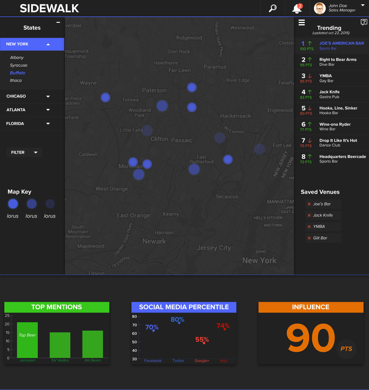
A) To redesign the data analysis dashboard page
B) To redesign the landing page
In our first meeting with Mr. Yehia, we learned a lot about his company and where he wanted to take it, but we still didn’t have knowledge of what his aesthetic preference was. To help us with this task we began by conducting a visual competitive analysis to see what other successful companies were doing and if Mr. Yehia wanted to go for the same look and feel of those sites. Each person chose two sites to look at and here are some takeaways I got from the sites I reviewed.
A) Strong hero images on the landing pages
B) Minimalistic iconography
C) Clean and professional
layout
D) Heavy usage of white space
Along with our visual competitive analysis, each person in my group created style tiles with different aesthetic feels to present to our client based on what we learned throughout our initial meeting.
Below you can see the directions I explored:

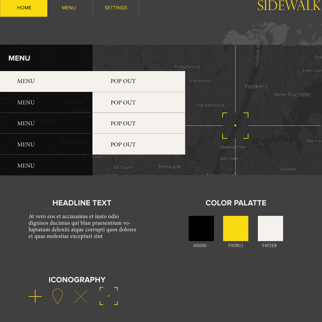
In our next meeting with Mr. Yehia, we presented him with style tiles, visual competitive analysis and received feedback on the design direction he wanted us to take. My next step was for me to make high fidelity mockups of the landing page and dashboard based off of wireframes our client gave to us.
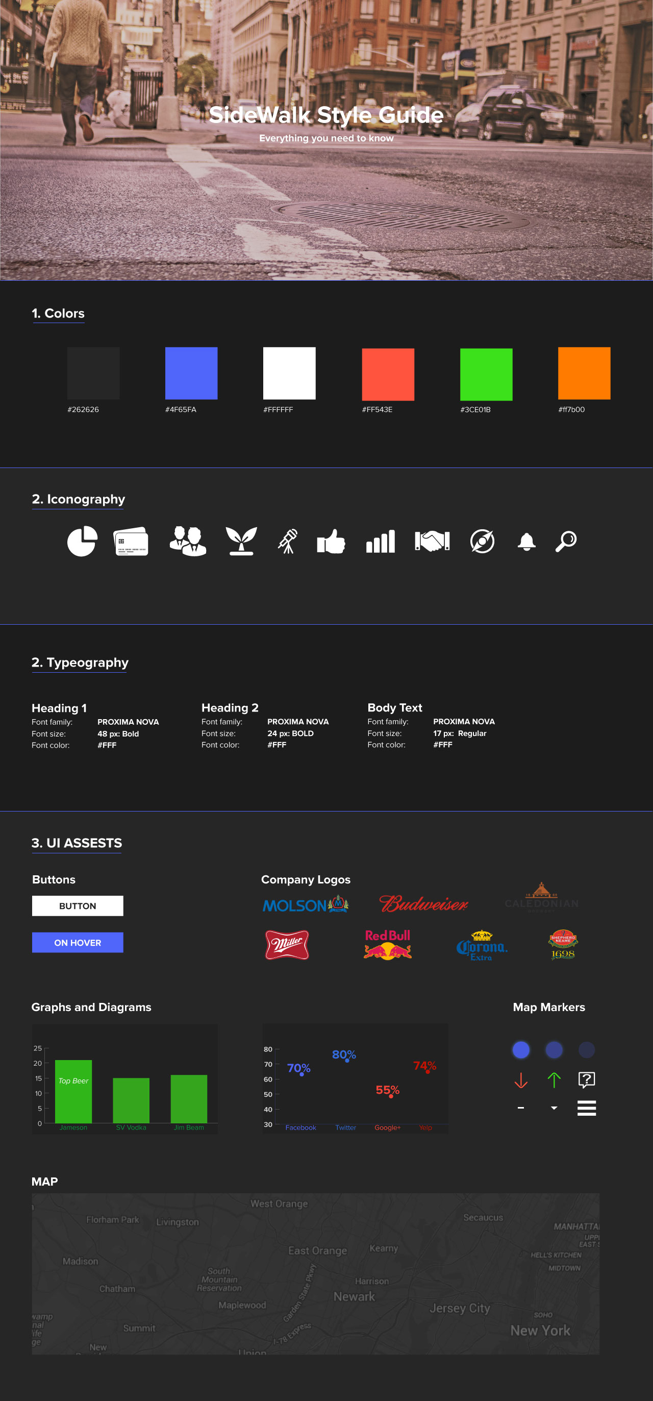
Mr. Yehia stated that he wanted a dark aesthetic for the background color of the website because he felt it would make the website look more professional and clean.

For the typography, I used the Proxima Nova font collection that was used on the previous website because our client stated that a lot of time was invested in choosing that font, and that is the one he preferred.

Our Client expressed his desire for simple iconography that appealed to a younger audience and would help give his website a “millennial” feel. He also stated that he liked the current iconography on his site and wanted the new icons to be similar but not the same. To meet his needs I used simple iconography throughout the website that I felt best matched his desires.