On April 9, 2015, LinkedIn announced that it had entered into an agreement to acquire lynda.com. Since the mission of LinkedIn and lynda.com are closely aligned it only made sense for the two companies to merge and change the way in which people connect to business opportunities.
This provided the background for an ideal prototype project during my time at DESIGNATION. I was grouped in a team of three and was responsible for the UI portion of this project but also participated in competitive analysis and user testing.
A) To change lynda.com's brand identity and aesthetic feel to
coincide with LinkedIn.com's
B) To research solutions to lynda.com’s value proposition to
its new LinkedIn clientele
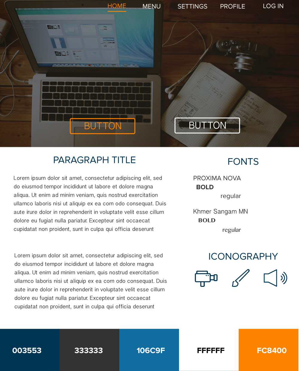
To begin our design process we started by researching several online learning platforms that were considered competitors of lynda.com. It was our goal to identify trends of the most successful online learning platforms and analyze what they were doing right, what they were doing wrong, and what they were not doing at all.
Below are examples of two competitors I analyzed:

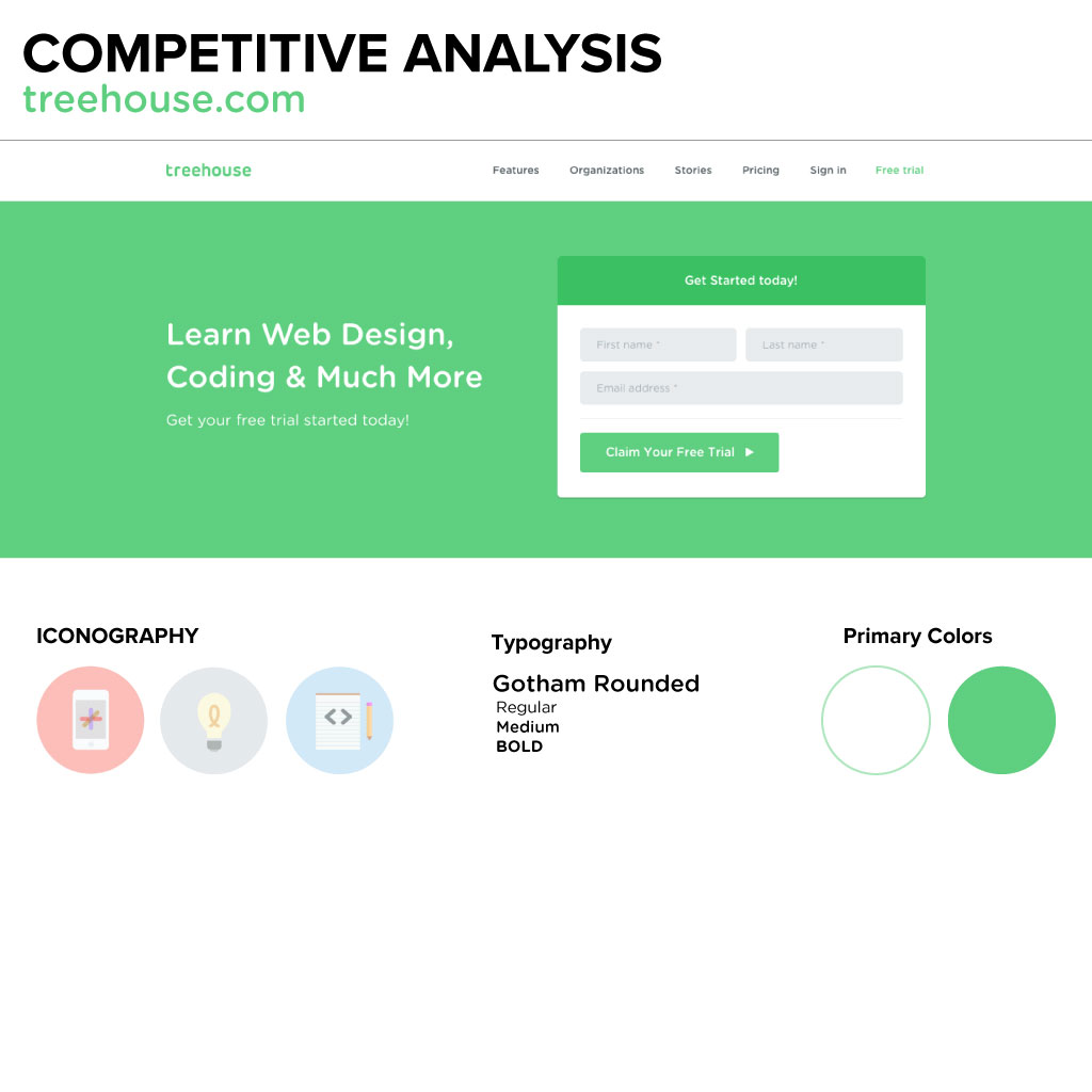
We analyzed over 12 sites and after a thorough review these were our key takeaways:
A) Strong hero images on
landing pages
B) Minimalistic iconography
C) Clean and professional
layout
D) Heavy use of white space
Before we proceeded with our creative exploration it was important that we had a clear understanding of who we wanted to create for. After plenty of research, and several user interviews my UX team members came up with the following personas and design principles.
The Career Explorer
Needs the ability to explore skill paths, learn in a cost
effective way, and get professional coaching and networking.
The Career Advancer
Wants the flexibility to learn anywhere from industry professionals, and then have the ability to show off their achievements.
Personalized
Getting to where you want to go on your own
terms means you’ll enjoy it more, stay longer and absorb more of what you want.
Empowering
Give users the tools to take the lead in their
education, reaching their professional and personal goals.
Connected
Sharing skills, assets and common interests lets
users help each other navigate opportunities and new career pathways.
Directional
Learning is both a teacher and a guidepost. As
users continue to grow in their skills, giving guidance early and often through
experts and peers, will help people achieve their goals.
User research and testing showed that most of our users wanted to explore a new career, or wanted to advance in their current one. The problem was that the online courses available for them did not prepare them properly for the job they were pursuing.
Our solution was to incorporate a mentorship program into lynda.com’s learning system. You could still take regular online courses if desired but also, could take micro degree courses, which would teach you everything you needed to know to land a job in your desired field. To help you with your courses you were paired with an online mentor who was currently a LinkedIn member in that same field. After the completion of your course, you'd gain access to a LinkedIn community that expanded your network and helped you to find you a job.
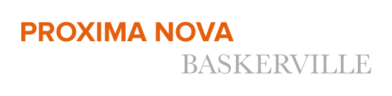
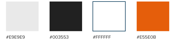
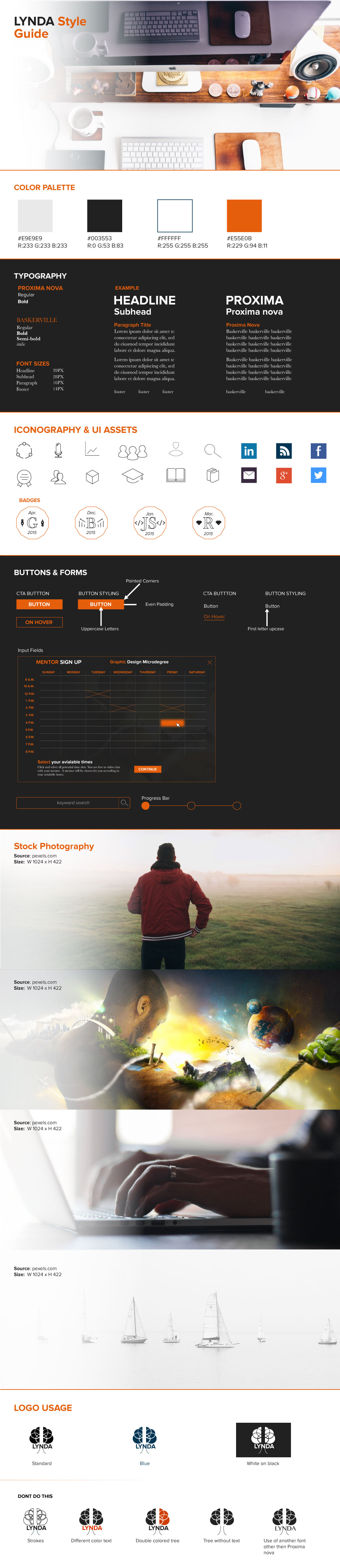
Creating a
style tile was the next step in my creative process. My goal was to incorporate any takeaways
from our previous research and apply the appropriate aesthetic to my style tiles.
I explored two different looks and you can see the examples of them below.

After deciding on my aesthetic direction I began making high fidelity screen mockups and prototypes based on the wireframes that were given to us by our UX designer.
For the typography, I used a sans serif and serif font pairing (Proxima Nova and Baskerville) that complimented the professional aesthetic that I was going for.
I felt that minimalistic and simple Icons best suited the age range of the users of lynda.com. With this simple iconography, it was easy to maintain a professional look and feel to the website.

I chose to use a limited color palette that contained the primary colors from LinkedIn.com and lynda.com to show the unification of the two websites.
My goal when creating the logo was to combine the aesthetic feel of LinkedIn.com with the educational aspect of lynda.com's site. The visualization I created references the images of a brain and a tree into one. This represents the growth that would occur after taking courses through lynda.com.


Feel free to take a walk through of my prototype on InVision to experience the process of signing up for a graphic design micro degree program: